Xi’Xian Airport City
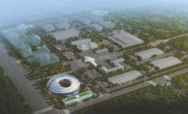
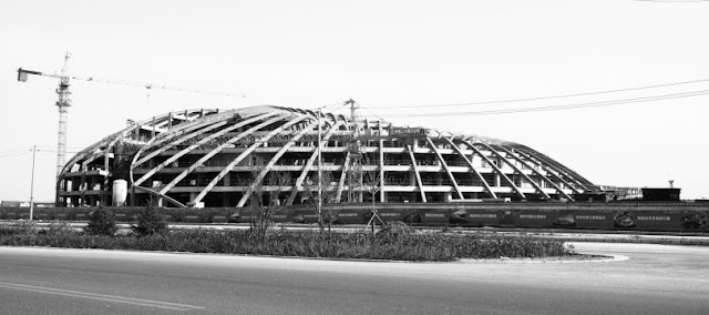
Located in a new zone adjacent to the Xi’an airport, the building – currently under construction – provides headquarters space for the Development Authority as well as extensive service space for customs and shipping operations. In addition, the building is divided to provide rental offices for a variety of trading and other companies doing business at the airport. Also included are an exhibition area, dining facilities, meeting rooms, and retail space.
The building is meant to give a strong image at the entry to the new city and to express the optimistic technology of flight: the landscape scheme includes the use of runway lighting to evoke the striking beauty of the contemporary airport. Who isn’t fascinated by flight? It’s both the most visible and most complex instance of technological magic that’s regularly available to us in everyday life. Any architect who claims not to be fascinated by aircraft is lying!
The miracle is that something that constructed, that mechanical, and that large could lumber into the air and fly around the globe. It does things that buildings are not supposed to do. But it is unmistakably a building. Indeed, modern architecture has long had a fascination with what many have thought to be technical superiority of great ships and airplanes and have sought to express their forms and capacities in buildings.
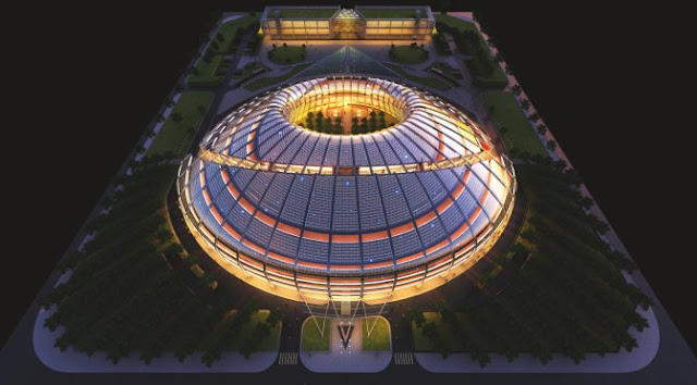
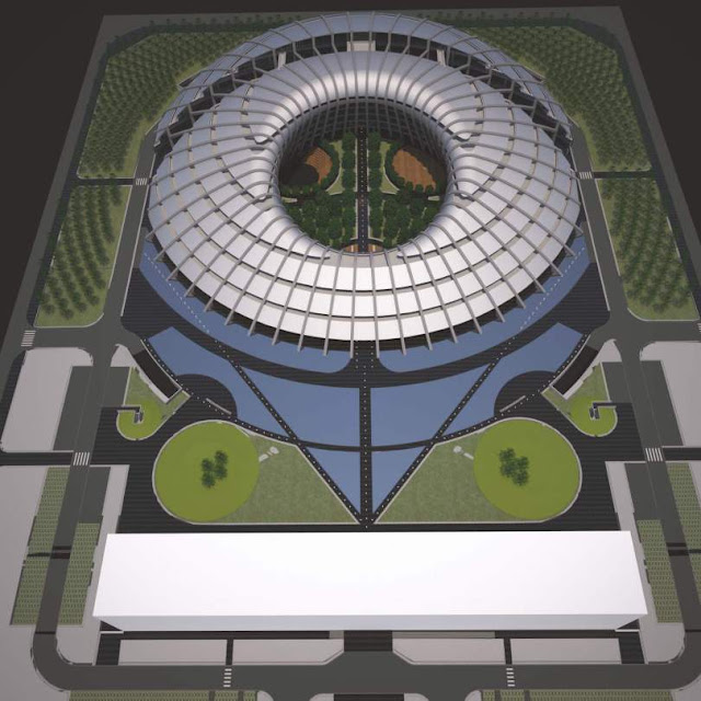
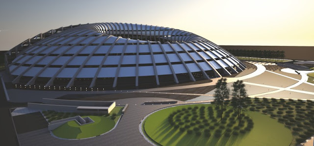
So, there’s no secret that the building we’ve designed is fond of the metaphor of aerodynamics. It began life as a tilted torus, a geometry we like but also one that has clearly aerodynamic qualities and our building might, to some, look a bit like a flying saucer. Because of the initial call that the complex be – at least technically – two buildings, we sliced the torus along a curve the opens up a small gap that runs from the east to the west side of the building and defines a circulation nexus as it runs through the glass joint where the pathset up by the entrance crosses.
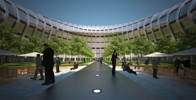
The center of the torus is large, landscaped void that offers light and air to the offices that surround it and a large social space for those who work in the building, and to the many who will visit the permitting and business counters that are the major use on the ground floor. The shape appealed to us for its futuristic image, its centrality and ability to hold down the site and mark a key entry to the city, and to its completeness within the scope of a low-rise volume: there is air traffic over the airport city and its buildings must always be rigorously low.
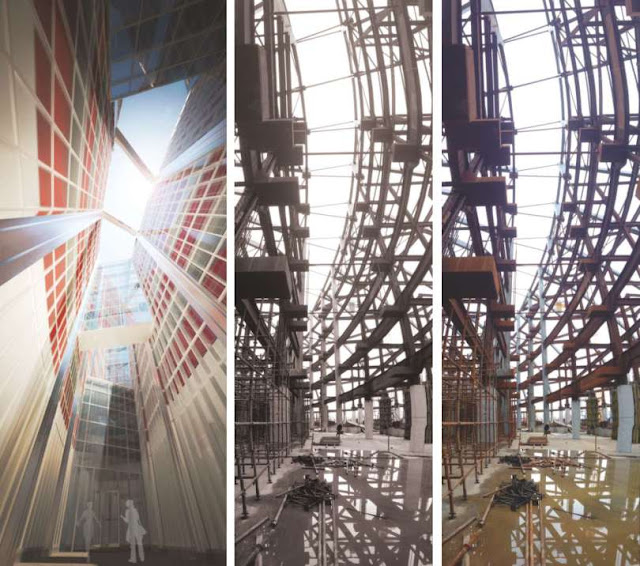
Clearly, a thirty meter height limit will not allow a city of skyscrapers! Instead, roof-lines will tend to meet a single horizontal plane and we sought to make our building – headquarters for the authority – exceptional in this context, formally distinct, sustainable, and efficient. We sought this at all scales. Offices are naturally lit and windows are operable for cross-ventilation. Each floor is surrounded by terraces to allow workers to set up a chair outdoors, to be in close contact with the landscaping, to have a semi-private means of circulation, and a place to grow trees and plants.
Indeed, the comfort – and therefore efficiency – of those working in the building was critical to us. The layout of the floors is relatively complex, helping to promotes feelings of individuality and flexibility. A range of interesting views – of the slice, the courtyard, the gardens, and the surrounding city are offered. The employee dining room is combined with an amphitheater to offer opportunities for collective gatherings.
A public gallery and commercial spaces are provided. And, the unusual building will contribute to a sense of identity for those who visit and work there. While we have a favorite nickname for the building, we are most curious about what people will call it, once it becomes part of the life of the new city. The building slopes to the south – originally to receive a photo-voltaic installation – but now to illuminate the spaces within, to allow future greenery, and perhaps the eventual installation of solar panels.
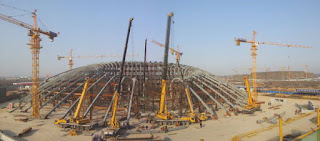
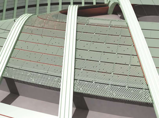
The slope also creates a series of geometrical and structural “problems” that we have solved in ways that we hope will make this building very special. The flying ribs, the complex cladding, the unusual spaces, the need to find ways to reconcile regularity and improvisation make this more than simply a circular or domed building but a place that is filled with particular formal and social inventions that will make it stand our among its neighbors and among buildings around the world. Finally, a word about the site scheme, which embodies another of our fascinations with the airport environment.
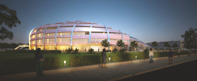
The airport runway is one of the great elements of the modern landscape. A strange flat place with huge objects maneuvering and roaring into the air, the lighting of these spaces – with blue, yellow, red, and green lamps – is both a work of art and a way of choreographing the motion of the jets that move through the space. Our site and building will also be illuminated works of art, with lines of light passing both in an out of the structure and with a glow rising from the court and a perforated skin that will glitter like the stars. Source by Michael Sorkin Studio.
Xi’Xian Airport City / Graphic files:
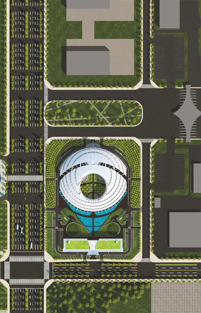 |
| Ground Plane |
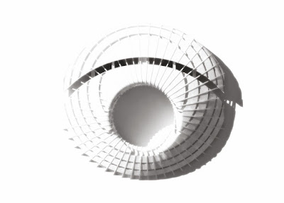 |
| Top view |
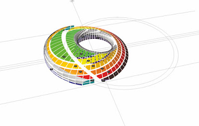 |
| Diagram |
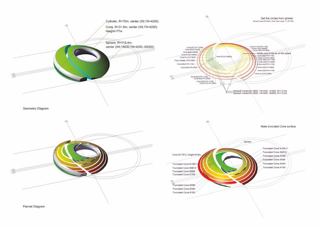 |
| Diagram |
 |
| Section |
 |
| Section |
Xi’Xian Airport City / Details files:
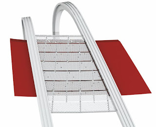 |
| Detail Metal Pannel |
 |
| Detail Metal site |
 |
| Detail |
Location: Xi’an, China
Architects: Michael Sorkin Studio
Project Team: Michael Sorkin, Makoto Okazaki, Ying Liu, Jie Gu
Yanqing Sun, Zhongquan Li, Qiang Du
Structure, Plumbing, HVAC, Electrical: Xi’an Architectural Design and Research Institute
Area: 70,203 sqm
Year: 2015
Photographs: Zhongquan Li, Yanqing Sun, Courtesy of Michael Sorkin Studio







0 comments:
Post a Comment